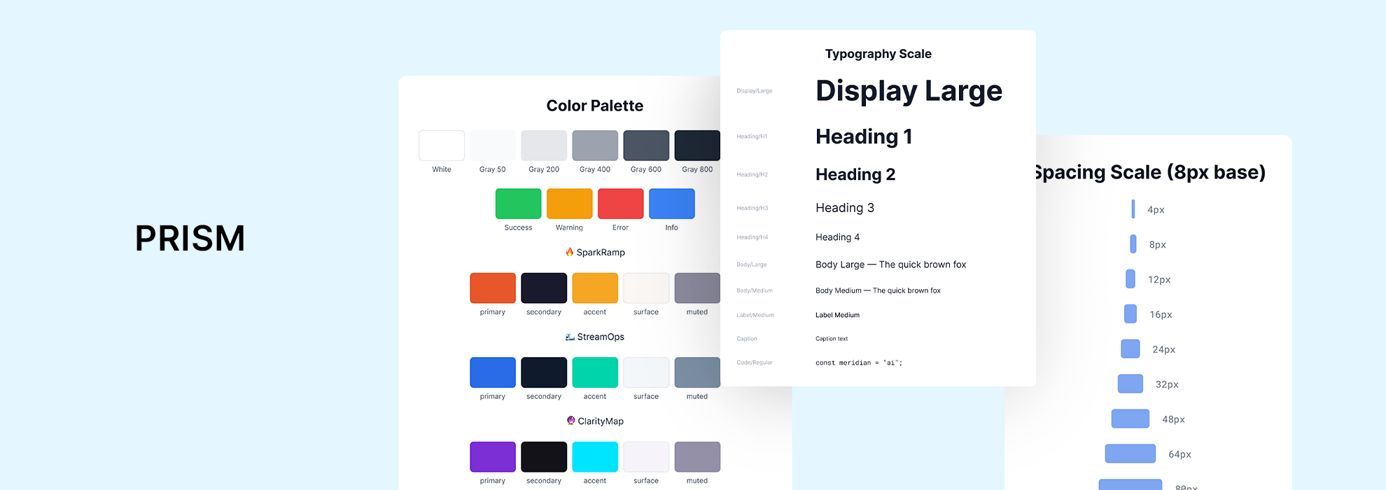
Prism is a collection of reusable components, design tokens, and guidelines that keep every product looking, feeling, and behaving consistently. Whether you’re building an onboarding flow in SparkRamp or a strategy dashboard in ClarityMap, Prism is the foundation underneath it all.
Design System Details
Live Preview
What is this Design System?
Built for scale. Designed for teams.
Prism is a collection of reusable components, design tokens, and guidelines that keep every product looking, feeling, and behaving consistently. Whether you’re building an onboarding flow in SparkRamp or a strategy dashboard in ClarityMap, Prism is the foundation underneath it all.
Value pillars:
- 🔲 Consistent — One component library used across all three products
- ⚡ Fast — Go from idea to production without reinventing the wheel
- 🎨 Themeable — Each product inherits its own identity while sharing the same core
Core Foundations
- Color System – 3 product palettes + shared neutrals & semantic colors
- Typography – General Sans + Instrument Sans + JetBrains Mono
- Spacing – 8px base unit, consistent across all products
- Motion – Rise · Glide · Reveal — one signature per product
- Grid – 4/8/12 columns at 640 / 1024 / 1440px breakpoints
- Icons – Lucide icon set — MIT licensed, free for commercial use
Component Library
- Headline: 25+ components. Ready to use. Group them visually:
- Inputs & Forms — Button, Input, Textarea, Select, Checkbox, Radio, Toggle
- Feedback — Badge, Toast, Tooltip, Spinner, Progress Bar
- Layout — Card, Modal, Accordion, Tabs, Navigation, Sidebar
- Rich — Carousel, Image Slider, Table, Dropdown, Pagination
Product Themes
One system. Three personalities.
🔥 SparkRam
- Warm orange-red
- Energizing & bold
- HR / L&D teams
🌊 StreamOps
- Steady blue
- Calm & guiding
- Ops / IT teams
🔮 ClarityMap
- Deep violet
- Authoritative & clear
- C-suite / Strategy
How to use this Design System?
Using Prism (For Designers)
Start designing in minutes.
Steps:
1. Install fonts — General Sans, Instrument Sans, JetBrains Mono (all free)
2. Open Figma — Access the Prism component library
3. Pick your theme — SparkRamp, StreamOps, or ClarityMap
4. Drag and drop — Every component is production-ready with variants
Developer Resources
Design tokens. Clean code. Fast handoff.
What’s included:
- Color tokens — All palettes exported as CSS variables / JSON
- Spacing scale — 8px grid system, ready to import
- Typography scale — 16 defined text styles with line-heights
- Component specs — Every component documented with states and variants
- Motion values — Easing curves and duration tokens
Code snippet preview:
/* Prism — SparkRamp Tokens */
–spark-primary: #E8572A;
–spark-secondary: #1A1A2E;
–spark-accent: #F5A623;
–spark-surface: #FAF7F4;
–spark-muted: #8B8B9E;