Lightweight: Gym App

Products Design

Result

Lightweight demonstrates the full product design workflow from problem framing to polished, functional UI. The project showcases cross-platform development, Figma-to-code execution, and deliberate product thinking. Making real trade-offs to serve a specific user rather than trying to serve everyone.

As a portfolio piece, it reflects the ability to scope and ship a focused product independently: identifying a genuine gap in the market, designing for a specific use case, and building something that feels complete rather than crammed.

Project Details

Brief

Lightweight is a focused mobile app designed for everyday gym goers who need two things done well: logging their workouts and tracking their calories. Built as a portfolio project, it demonstrates cross-platform product thinking. From user research and Figma prototyping to a clean, production-ready UI shipped on iOS, Android, and the web. The app is deliberately scoped to show that great product design is about knowing what to leave out, not just what to put in.

Website

Role

Product Designer

PROBLEM

A gym goer has two non-negotiable daily habits: logging their workouts and tracking their calories. The tools available today force them to compromise on at least one.

  • Workout-first apps like Hevy and Strong do an excellent job of routine management but offer no meaningful calorie tracking.
  • Nutrition-first apps like MyFitnessPal cover calories well but deliver a workout logging experience that feels like an afterthought.
  • All-in-one apps try to solve everything and end up bloated with features the average gym goer never touches, yet still pays for.

The result: gym goers juggle two separate apps, or settle for a worse experience in one of the two areas that matter most to their goals.

TOOLS USED

  • Figma
  • Claude Code
  • Expo Go for simulation purposes

PROCESS

The project followed a standard product design cycle adapted for solo execution:

  • Discovery: Competitive analysis of Hevy, Strong, and MyFitnessPal to identify UX gaps and feature overlap.
  • Scoping: Defined a lean feature set of four core screens, with a phased roadmap for a future coach dashboard.
  • Design: Wireframes and high-fidelity screens produced in Figma, covering mobile-first layouts for iOS and Android.
  • Development: Cross-platform implementation built to run on iOS, iPadOS, Android, and modern browsers.
  • Iteration: UI reviewed against real gym workflow; refined for speed of use mid-session when hands are busy.

INDUSTRY

  • Fitness
  • Health

Strategy

Rather than building a feature-complete fitness super-app, the strategy was radical focus. Identify the two tasks a gym goer performs every single day, then make those two tasks as fast, intuitive, and frictionless as possible and cut everything else. This constraint also shaped the name: Lightweight.

Competitive apps were mapped against user needs to find the gap: a well-designed tool that handles both workout logging and calorie tracking without sprawl. Lightweight targets that gap directly, positioning itself as the app that respects the user’s time and cognitive load.

SOLUTION

Lightweight was designed around one principle: do two things, and do them exceptionally well. By focusing exclusively on workout logging and calorie tracking, the app removes the noise that weighs down competing products.

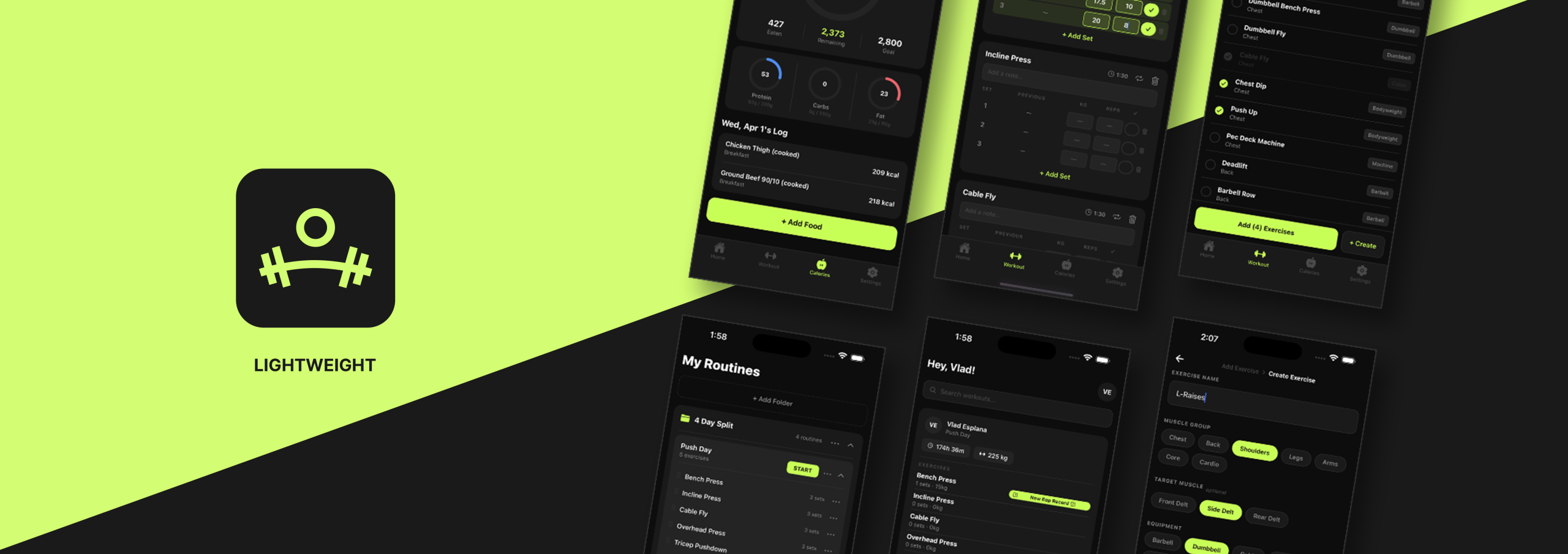
The workout logger is built around how gym goers actually train: Seamless and fast routine organization, drag-and-drop reordering, easy modification, and folder-based structure to keep routines manageable over time. The calorie tracker is purposeful and direct, surfacing TDEE-based goals on the main screen without burying them in settings menus.

Two features. Done right. Nothing more – hence the name, Lightweight.

Gallery

Feed

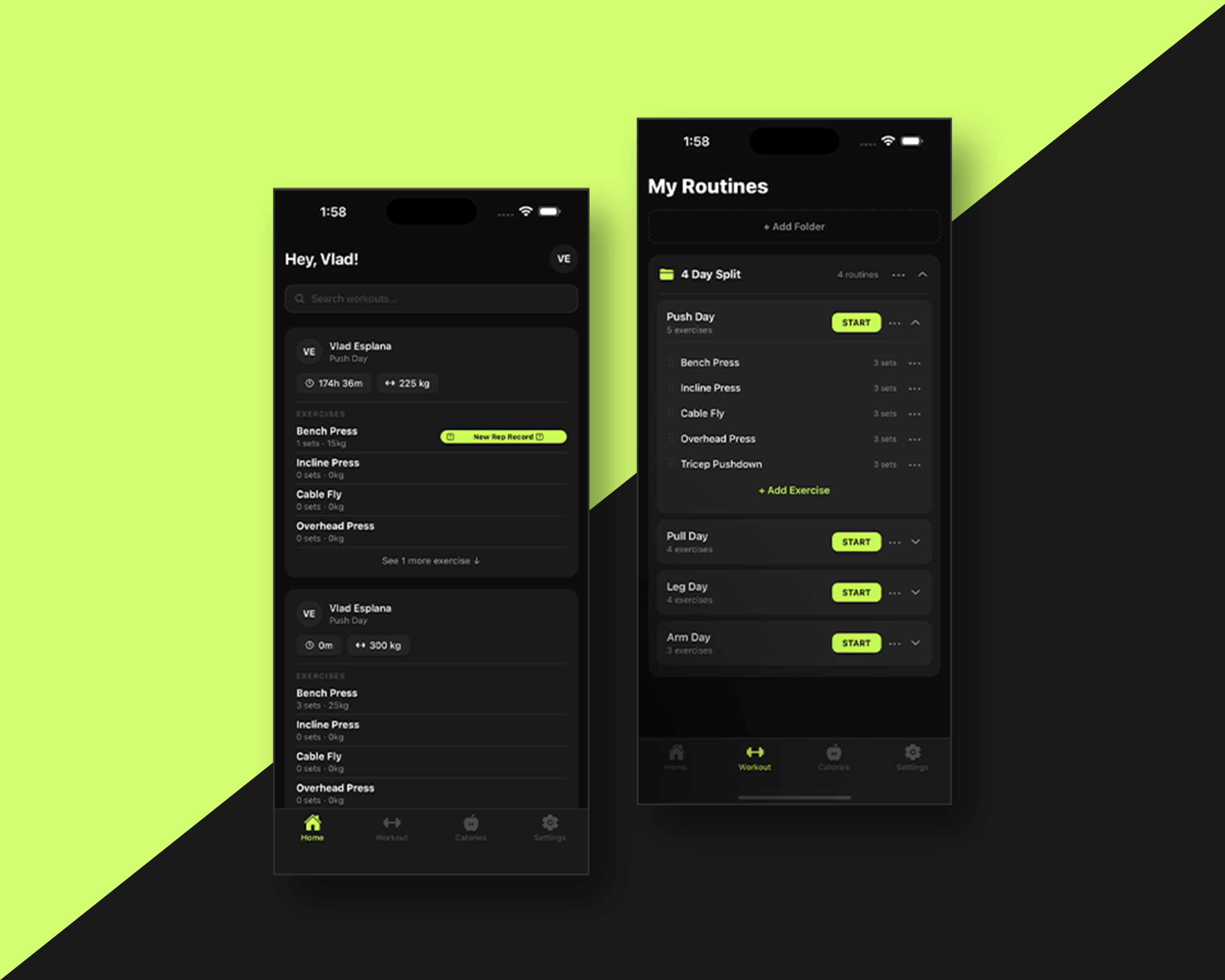
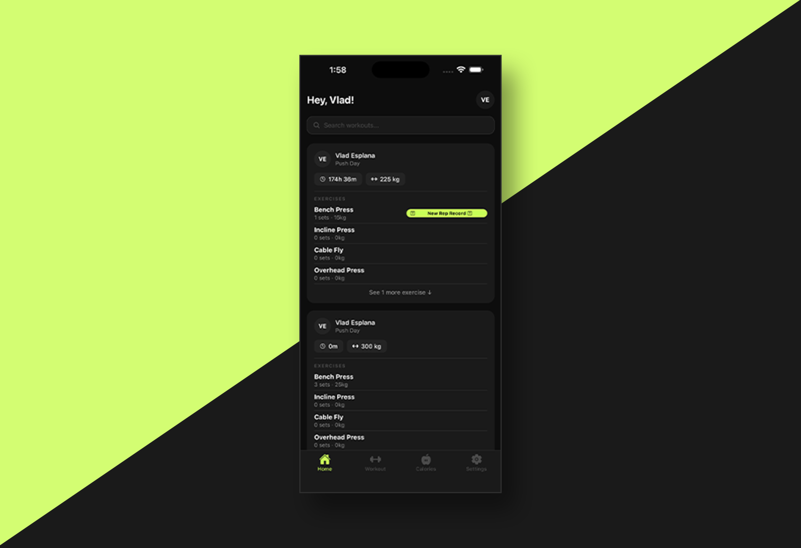
The Home tab serves as the user’s workout history. A personal feed of every session logged through the app. Workouts are displayed in a familiar social-feed format, similar to how posts appear on Instagram or Facebook, making it easy to scroll back through past sessions at a glance. Each entry captures what was done, when, and at what volume, giving the user a motivating, visual record of their progress over time.

Workout

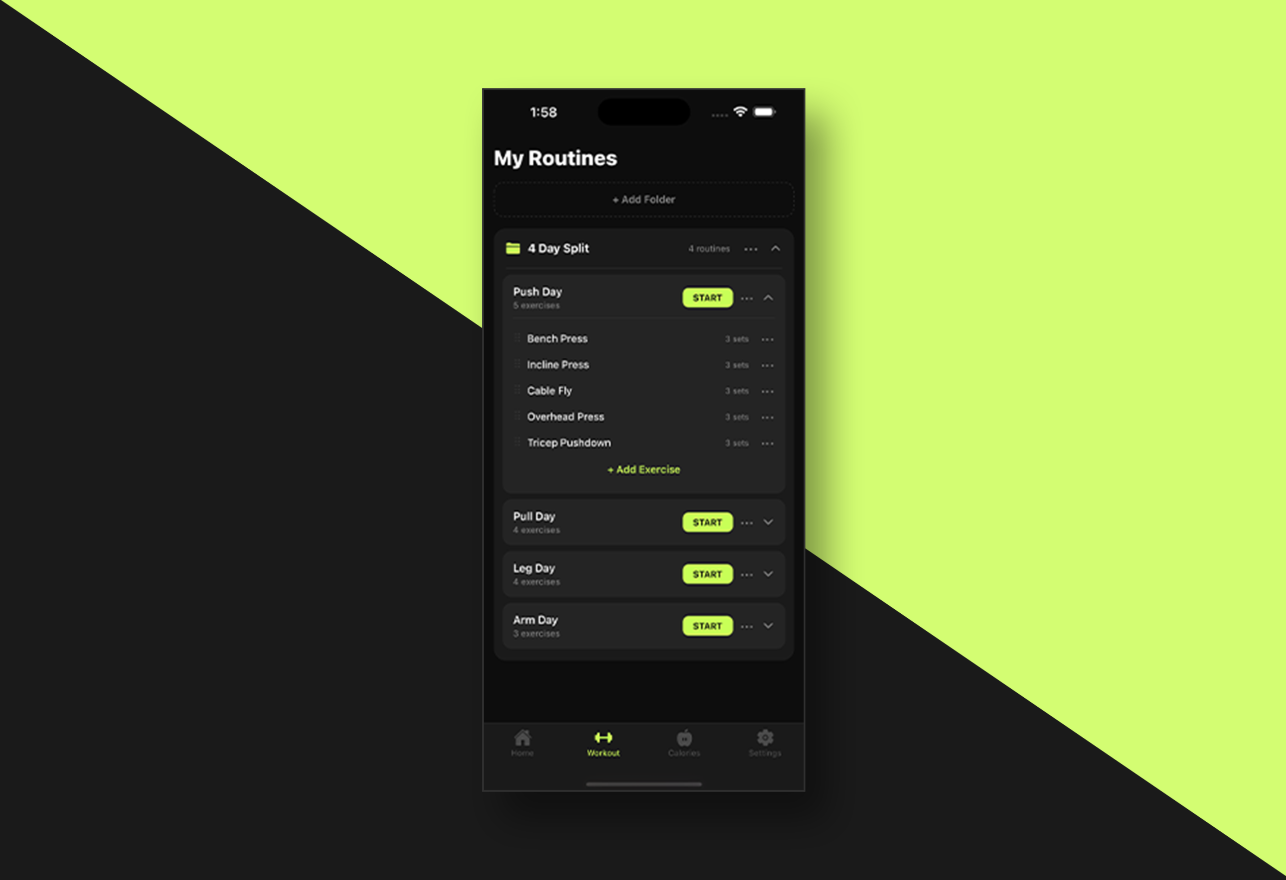
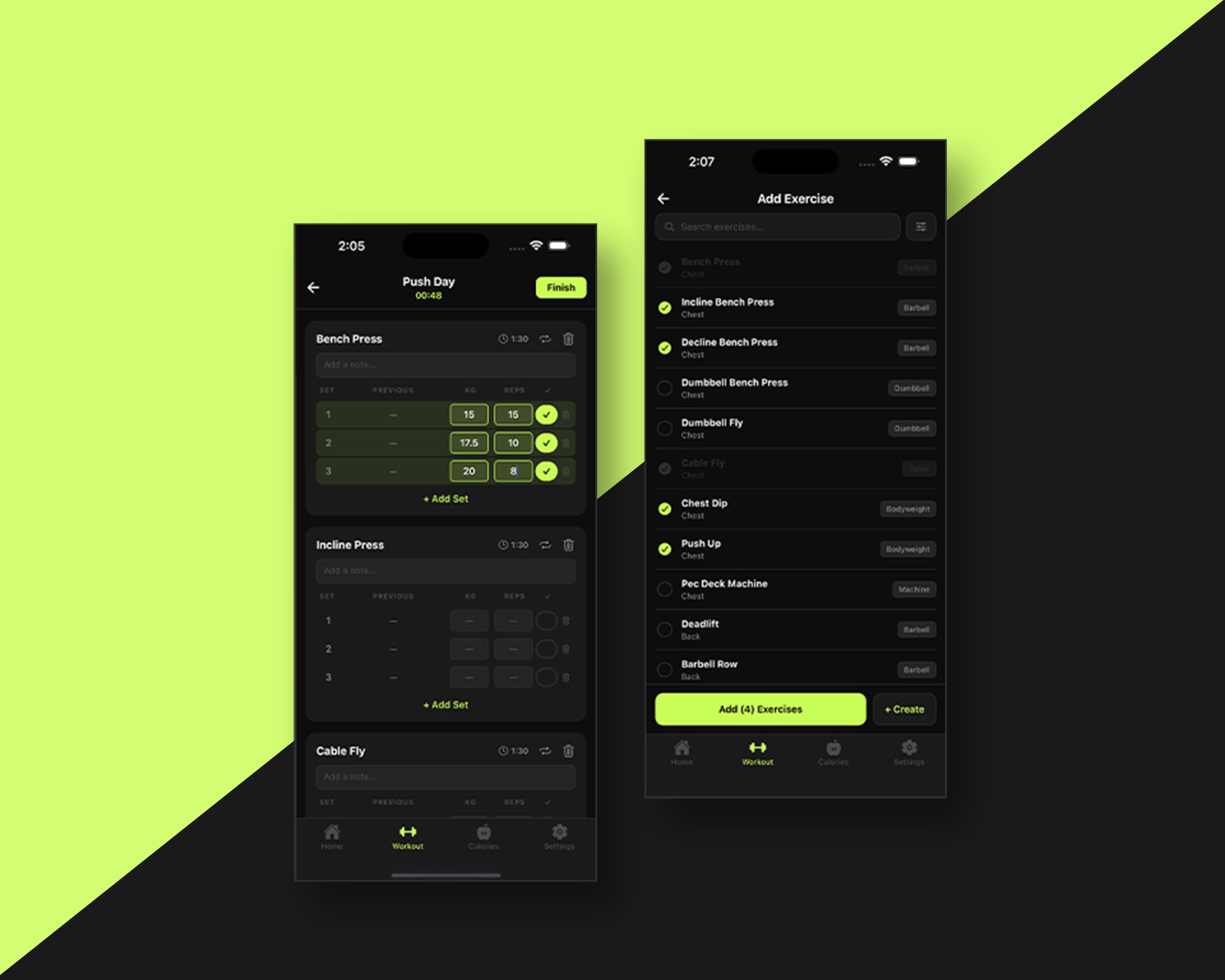
The Workout tab is the app’s core logging experience. Users can create, organize, update, and delete routines from a single screen. No hunting through menus. Routines live inside folders for easy categorization, and exercises can be reordered on the fly. Everything is built around the speed and simplicity needed when you’re mid-session with limited time between sets.

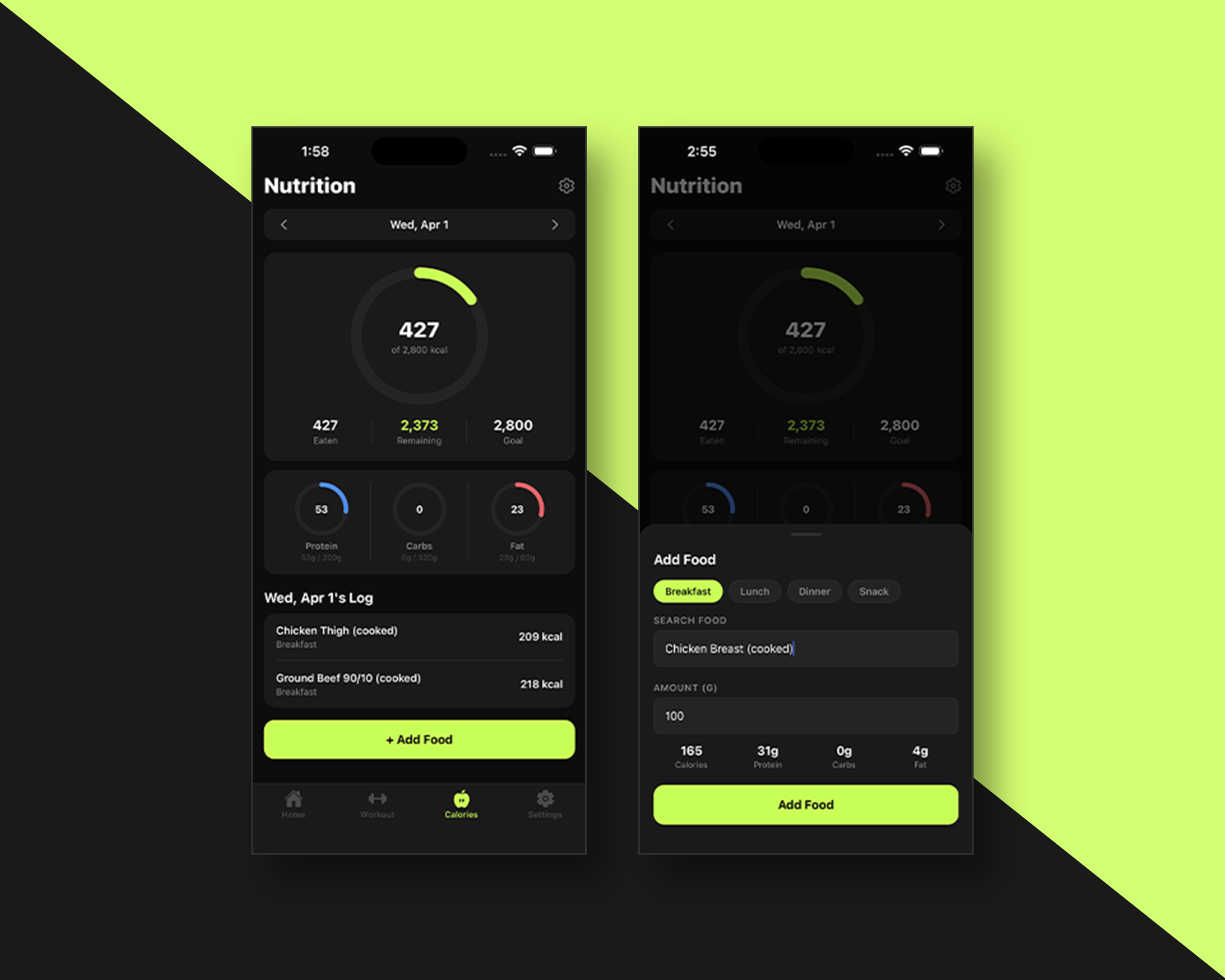
Calorie Counter

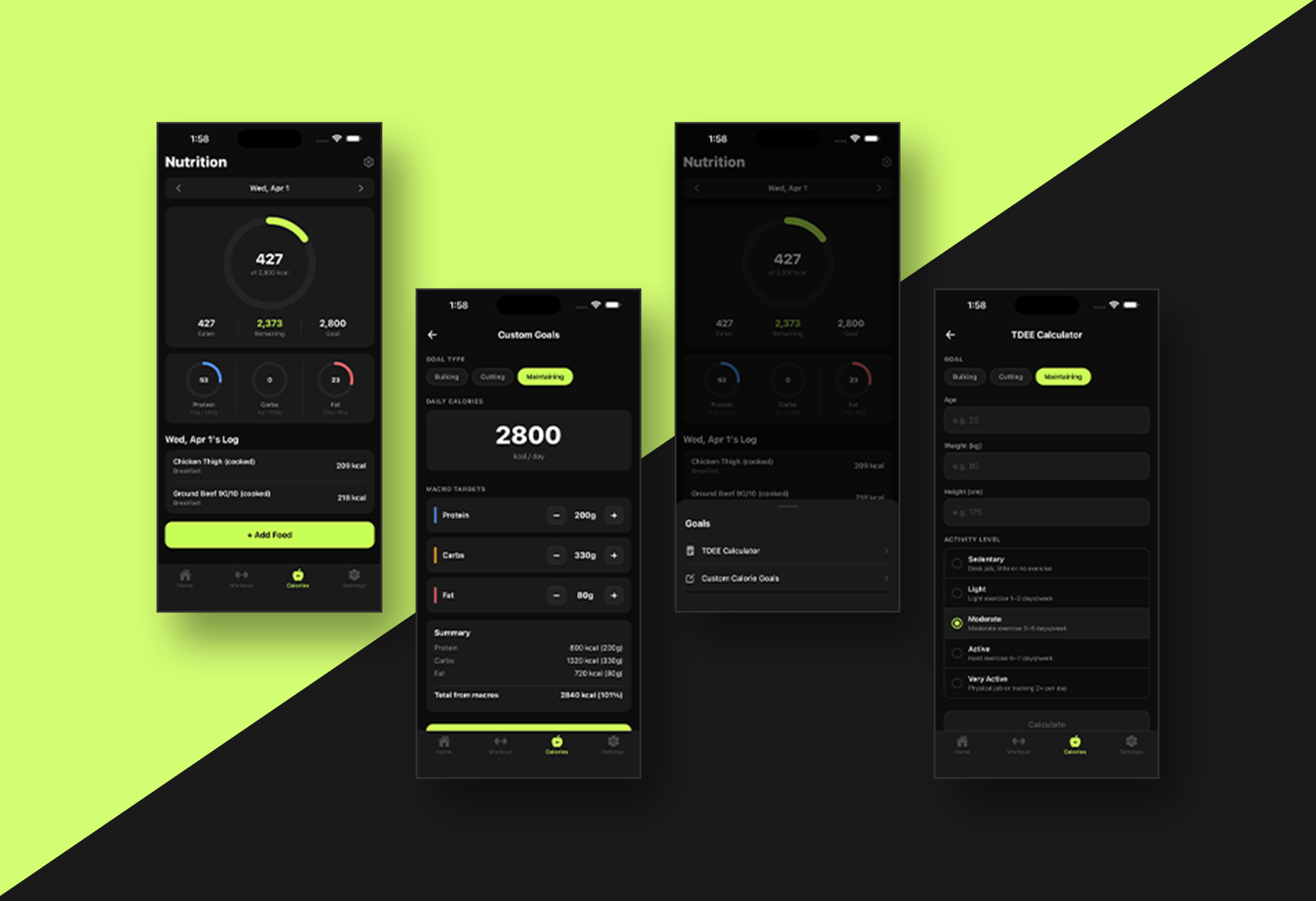
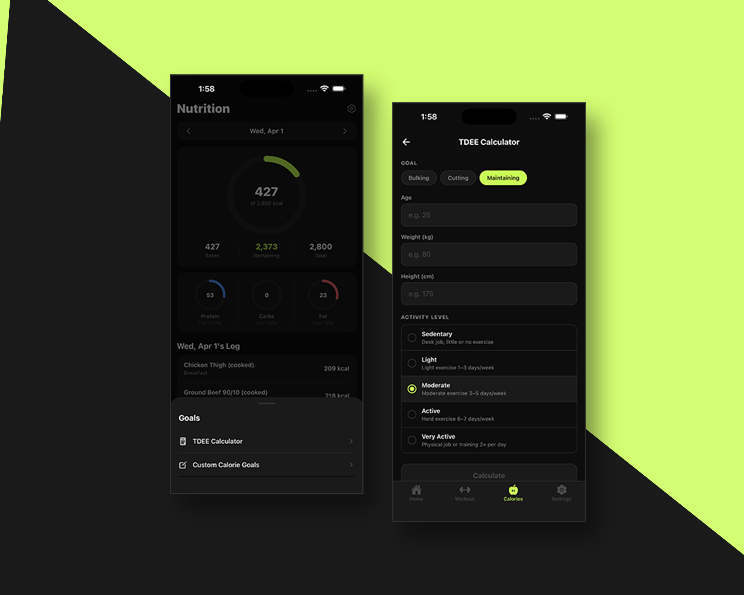
The Calorie Counter tab tracks daily calorie intake against the user’s personal goal. Two settings power the experience: a built-in TDEE calculator that estimates daily energy needs based on the user’s stats and activity level, and a Custom Goals option for users who already know their targets. Both settings feed directly into the main view, keeping the daily calorie target visible and actionable without extra navigation.

Settings

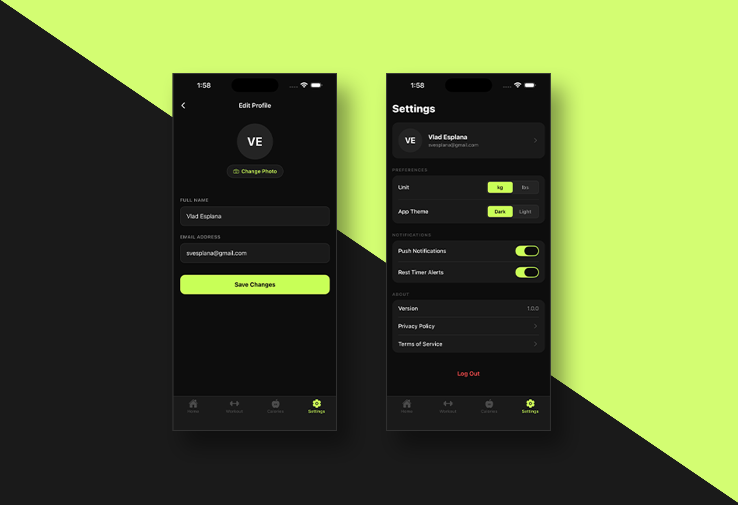
The Settings tab gives users control over how the app looks and behaves. Account information, preferred unit of measurement (imperial or metric), app theme, and notification preferences can all be configured here. Users can also update their personal details at any time while keeping their profile and goal calculations accurate as they progress.

Add and Create Exercises

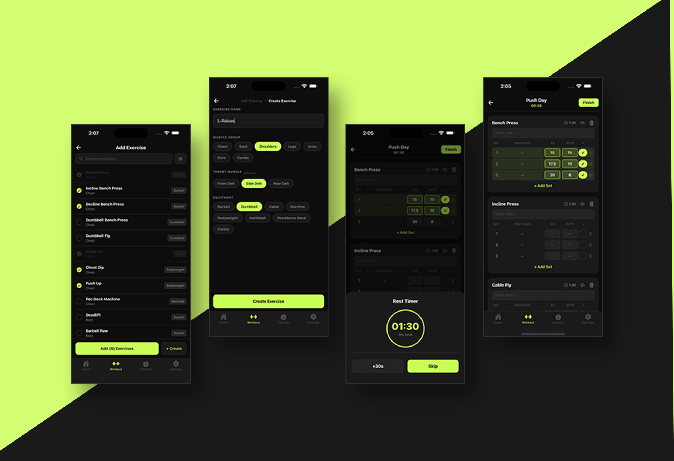
The add and create excercises are a sub feature of the Routine feature that enables the user to add an existing exercise in the routine they are doing. From this feature as well, the user can create a custom exercise with the options to select which main and sub muscle it targets.x